

A business website works best when visitors can understand the information and complete the next step in different situations: on a phone, with a keyboard, with enlarged text, or while using assistive technology. Accessibility is part of the customer experience and the quality of a web build. It also improves ordinary usability for people who are busy, distracted, or unfamiliar with the business.
This checklist gives a small-business owner a practical place to start when reviewing a new website or planning a redesign. It is not a technical audit or a determination of legal compliance. For a formal assessment, ask a qualified accessibility professional to evaluate the actual site and the requirements that apply to your organization.
Make the structure easy to follow
Start with the page outline. Each page should have one clear main heading, followed by section headings that describe the content underneath. Headings should form a sensible hierarchy rather than being selected only for their visual size. This helps visitors scan the page and gives assistive technologies a useful outline.
Keep navigation labels descriptive and consistent. A link called “Services” is easier to understand than a vague “Learn more” when visitors are moving quickly. Menus should work with keyboard input as well as a pointer, and the current focus should remain visible as someone moves through links and controls. Avoid hiding important information behind interactions that only work on hover.
Check text, contrast, and links
Read the page at normal size and zoom in. Body text should remain readable without forcing horizontal scrolling, and important instructions should not depend on color alone. For example, a form error should include clear text instead of only turning a field border red. Check contrast between text and its background, especially for small labels, placeholder text, buttons, and text over photos.
Use link text that tells people where it goes. “View our WordPress development service” is more informative than “click here.” Review the color and underline treatment in the actual design so links can be recognized without relying solely on a subtle shade difference. Keep sentences direct and explain industry terms the first time they appear.
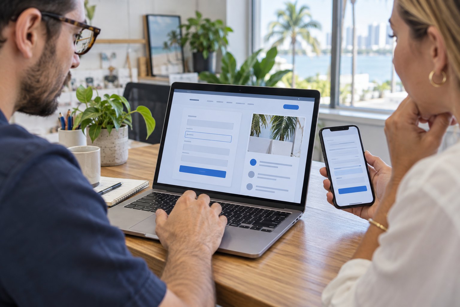
Test forms from start to confirmation
Forms are often the most important interactive part of a small-business website. Every field should have a visible, understandable label. Instructions should explain what information is needed, and required fields should be identified in text. Test what happens when a visitor leaves a required field blank or enters information in the wrong format. Error messages should explain how to fix the problem and should be easy to locate.
After submission, confirm that the visitor receives a clear success message or other useful next step. Check that the business receives the inquiry at the intended email or system. Test the form with a keyboard and on a phone. Keep questions relevant to the next business step; collecting unnecessary details adds friction and may create avoidable privacy concerns.
Give images and media useful context
For an image that communicates information, write concise alternative text describing its purpose. Decorative images can use empty alternative text so they do not add noise. Do not stuff alt text with search phrases or repeat the caption word for word when that does not help. If a video contains speech or essential sound, provide captions and check that controls are usable.
Review the actual images at mobile size. Text baked into a graphic can become difficult to read and may not be available to assistive technology. Put essential instructions in page text instead of relying on an image to carry them.
Run a simple keyboard and mobile check
Put the mouse aside and use Tab, Shift+Tab, Enter, and the arrow keys to move through the main navigation, buttons, and form controls. Confirm that focus is visible, follows a sensible order, and does not get trapped in a menu or pop-up. Then use the site on a phone, increase text size where available, and test the key actions without precision tapping.
Automated tools can help find some issues, but they do not understand every context or prove that a page is easy for people to use. Combine tool results with manual checks and, when possible, feedback from people who use assistive technology. Prioritize barriers that block understanding or completion of a real customer task.
Include accessibility in the website project
Discuss these checks during planning, design, content entry, and launch instead of waiting until the end. Define who reviews copy, who supplies image descriptions, how form errors are tested, and how the site will be checked after updates. For WordPress websites, reusable patterns and editor guidance can help teams apply headings, labels, and media descriptions consistently as pages change.
iDvlpr Marketing builds websites with human-reviewed AI workflows, WordPress development, customer paths, and launch QA. Explore our website design and development services, learn about WordPress development, or use the first-month website launch review to organize post-launch checks. To discuss an accessible, practical website project, contact iDvlpr Marketing or email gary@idvlprmarketing.com.
Important: This article provides general website usability information. It does not determine whether a website or business meets any legal standard. No ranking, traffic, lead, speed score, revenue result, or perfect score is guaranteed.